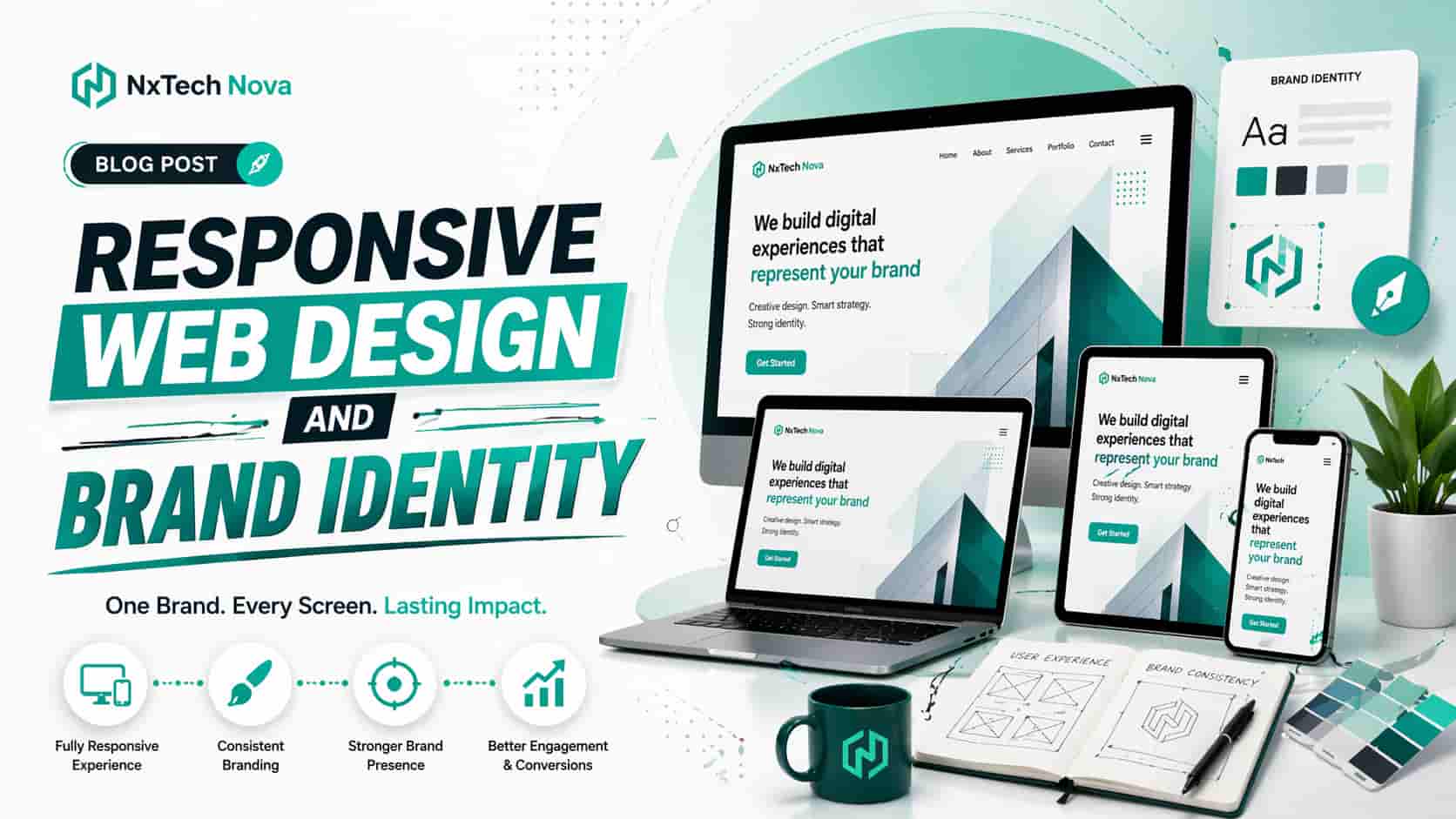
How can responsive web design and development enhance your brand identity?
A few months ago, imagine a business owner opening their own website on a phone while standing in line for coffee. On desktop, the site looked polished. On mobile, the text felt cramped, the button sat too low, the logo lost impact, and the page loaded with an awkward jump. In that one moment, the brand no longer felt premium. It felt unfinished.
That is exactly where many businesses lose trust without realizing it. They think branding lives in a logo, a color palette, or a tagline. In reality, branding is also the feeling your website creates when people use it. If that experience is clumsy on one screen and smooth on another, your identity starts to feel inconsistent.
Responsive web design and development fixes that problem at the root. It helps your website adapt visually, technically, and strategically so your brand looks professional everywhere. It also helps your message stay clear, your user journey stay simple, and your conversions stay strong.
Instead of stopping at theory, this guide breaks the topic down in a practical way.
-
You will see why responsive development matters more than ever for mobile users
-
You will learn how branding should be built into the design system, not pasted on top of it
-
You will understand what real website development services should include
-
You will see why custom professional work often outperforms generic templates
-
You will learn how responsive design strengthens your wider digital presence
If you have been comparing a website development company near me, this is the lens that matters most. The right partner should not only build pages. They should help your brand feel stronger every time someone visits your site.
Many businesses also make one costly mistake. They treat web design as a visual project and web development as a technical project. In practice, the two are inseparable. Design shapes how people feel. Development shapes how that feeling performs in the real world.
That is why responsive web design is so closely tied to brand identity. A modern brand is not judged only by what it says. It is judged by how easily people can interact with it, trust it, and move through it.
Why is responsive web development important for mobile users in 2026?
Mobile users are no longer the secondary audience. For many businesses, they are the first audience, the fastest audience, and often the most impatient audience. They search quickly, compare quickly, and leave quickly when a site feels slow or confusing.
That makes responsive web development a brand issue, not just a device issue. If someone visits your site on a phone and sees cropped images, hard to read text, broken spacing, or clumsy forms, they do not separate that experience from your business. They assume your business operates with the same lack of care.
A responsive site protects your brand at that first point of contact. It ensures your layout, typography, images, menus, forms, and calls to action adjust in a way that still feels intentional. The goal is not just to shrink a desktop site down. The goal is to create a mobile experience that still feels like the same brand.
This matters even more in 2026 because mobile behavior is shaped by speed and convenience. Users expect pages to load cleanly, buttons to be easy to tap, menus to be simple, and content to be easy to scan. They do not want to zoom, pinch, or fight the page.
A lot of generic content says responsive design improves user experience, and that is true. But the real point is more specific. Responsive design improves the moments that decide whether your brand feels modern or forgettable.
Think about what a mobile visitor notices first.
-
Whether the page loads without frustration
-
Whether the headline is readable at a glance
-
Whether the menu feels obvious
-
Whether the brand looks consistent and trustworthy
-
Whether the next step feels easy to take
When those five things work together, users stay longer. They trust faster. They move with less resistance. That creates a stronger brand impression than any slogan ever could.
For service businesses, mobile visitors often arrive with intent. They may already know the problem they want solved. They just need reassurance that your business is credible. If the website feels sharp, organized, and responsive, trust builds quickly.
For ecommerce brands, mobile responsiveness directly shapes buying behavior. Product grids, filters, image scaling, sticky add to cart actions, and checkout flow all affect whether your store feels effortless or exhausting. A stylish brand can still lose sales if the mobile path feels heavy.
For content driven brands, mobile responsiveness affects clarity and authority. If blog pages are hard to scan, if line lengths feel messy, or if headings collapse awkwardly, your expertise becomes harder to trust.
This is also where responsive design intersects with search visibility. Fast, stable, well structured pages help create a better experience for users and a stronger foundation for discoverability. In simple terms, good design supports good performance, and good performance supports growth.
You can see this clearly when a business says its website is getting traffic but not enough leads. Often, the issue is not the traffic itself. The issue is that mobile users arrive interested and leave unconvinced. The site may technically load, but it does not guide people smoothly enough to action.
That is why modern responsive web development focuses on more than breakpoints. It focuses on behavior.
A serious build should account for:
-
thumb friendly button placement
-
readable type hierarchy
-
short mobile forms
-
compressed media without visual loss
-
stable layout during loading
-
clear conversion paths from top to bottom
-
trust signals that remain visible on smaller screens
This becomes even more important for businesses in complex sectors. A health brand may need a calm, accessible interface that feels safe and clear. A fintech business may need a highly structured layout that communicates stability and control. A real estate platform may need multilingual support and a responsive search experience that works perfectly on the move.
Even technical choices behind the scenes affect how the brand feels. If your team is debating a frontend stack, migrating a legacy PHP site, or improving a sluggish store, the question is never only about code. It is about whether the final experience protects the brand in real world use.
If your current site feels fine on desktop but weak on mobile, that gap is already shaping how people perceive you. In 2026, responsive quality is not a bonus. It is the baseline people expect before they take your brand seriously.
How to incorporate branding into web design for a professional look?
A professional website does not feel branded because a logo was placed in the corner. It feels branded because every detail supports the same visual and emotional message.
That means branding in web design has to go deeper than surface decoration. It must influence structure, content flow, spacing, typography, imagery, interface behavior, and the overall tone of the experience.
The easiest way to think about it is this. Brand identity answers who you are. Web design translates that identity into something people can feel and navigate.
When businesses skip this step, the result is usually obvious. The logo may look good, but the site feels generic. The colors may be right, but the page does not communicate the business personality. The copy may be polished, but the layout feels disconnected from the message.
A professional look comes from alignment.
Your web design should align these core elements:
-
Color usageYour color system should do more than decorate. It should create hierarchy, guide attention, and reinforce recognition. Strong brands use color intentionally, not randomly.
-
TypographyFonts should match the brand personality and remain readable across all devices. Elegant brands may lean refined. Technical brands may prefer clarity and structure. Friendly brands may use softer visual rhythm.
-
ImageryPhotos, illustrations, icons, and visual treatments should feel like they belong to one world. Mixed styles weaken trust. Cohesive imagery strengthens recall.
-
Spacing and layoutSpacing affects how premium a site feels. Crowded layouts feel rushed. Balanced layouts feel thoughtful and confident.
-
Voice and messagingProfessional branding is not visual only. Headlines, button text, descriptions, and calls to action should sound like the same brand in every section.
-
Interface behaviorHover states, transitions, menus, accordions, and forms all contribute to the brand feel. Smooth interactions suggest care. Clumsy interactions suggest compromise.
This is why the strongest websites are usually built on a design system, even if the business never calls it that. A design system gives your site repeatable rules for colors, buttons, cards, forms, spacing, headings, and reusable sections. That keeps the brand consistent as the website grows.
Without that system, inconsistency creeps in fast. One page uses one button style. Another page uses another. One landing page feels minimal. Another feels crowded. One service page sounds confident. Another sounds generic. Over time, the brand becomes fragmented.
A professional web design process should solve that before development starts. It should define how your brand appears across every screen size and every major page type.
Here is a practical way to incorporate branding into your design.
-
Start with your brand attributesDecide how you want people to describe you. Premium, trusted, fast, bold, calm, technical, creative, exclusive, approachable, or authoritative.
-
Turn those attributes into visual rulesA premium brand may need stronger white space, elegant type, restrained color use, and high quality imagery. A fast moving startup may need sharper contrast, simpler navigation, and bolder action areas.
-
Define responsive behavior earlyBranding should not change personality when the screen gets smaller. Your mobile layout should still feel like your desktop identity, just more focused.
-
Create reusable componentsButtons, cards, forms, service blocks, testimonials, and callout sections should follow clear visual rules.
-
Match content tone to interface toneIf your visuals feel refined but your copy sounds flat, the brand loses coherence.
This matters even more for businesses with specialized requirements. A luxury brand might want a dark, editorial look that still performs smoothly on mobile. A bilingual site may need careful layout logic so English and Arabic content both feel native to the brand. A content heavy business may need a CMS setup that keeps branded consistency intact even when many people update pages over time.
This is one reason businesses often outgrow basic themes. Themes can give you a starting look, but they rarely give you a fully branded system. Real brand integration takes planning, not just styling.
If your site depends on flexible publishing, editorial control, and future growth, investing in wordpress website design and development can be a strong move when it is handled strategically. The advantage is not simply using WordPress. The advantage is shaping it around your brand instead of forcing your brand into a prebuilt mold.
Branding also needs to be visible in the moments where users hesitate. That means your site should reinforce trust through consistent form design, clear service positioning, social proof placement, testimonials, FAQs, and reassurance near call to action sections.
A professional website does not look professional because it follows trends. It looks professional because it knows exactly what it wants to communicate and does so consistently on every page.
What are the key elements of website development services for businesses?
A lot of businesses think website development services mean design mockups plus coding. That is only a small part of the picture. Real website development services should support strategy, usability, performance, content, integrations, and long term scalability.
If an agency talks only about visual design or only about code, something important is missing. Businesses need a solution that works as a system, not a collection of disconnected tasks.
A complete website development process should include the following core elements.
- Discovery and positioning
Before anything is designed, the team should understand your business goals, audience, offer, market position, and conversion priorities. A website built without this phase may look clean, but it often fails to say the right thing to the right people.
- Information architecture
Your pages should be organized in a way that makes sense to visitors. Navigation, page hierarchy, service grouping, and internal linking all affect how easily users understand your offer.
- Responsive user experience design
A serious build plans for desktop, tablet, and mobile from the start. It does not treat mobile as a late stage adjustment. Layout shifts, card stacking, button sizing, image handling, and content prioritization should all be intentional.
- Frontend development
This is where designs become functional interfaces. Clean frontend work affects speed, consistency, and overall polish. Poor frontend work can make even a strong design feel unstable.
- Backend and CMS setup
Your site needs an editing environment that matches how your team works. Some brands need simple page editing. Others need custom fields, dynamic content, gated sections, multilingual support, or deeper workflow control.
- Technical SEO foundations
Strong website development includes crawlable structure, clean heading hierarchy, metadata support, optimized images, logical internal linking, schema opportunities, and performance aware code structure.
- Performance optimization
Speed is not something to add later. It should be part of the build. That includes image compression, lazy loading, asset management, script control, caching strategy, and stable layout behavior.
- Accessibility and usability
A business website should be usable by more people, not fewer. Clear contrast, keyboard awareness, readable forms, proper labels, and structured content all matter.
- Conversion path planning
Every page should know what it wants the user to do next. Book a call. Request a quote. Start a trial. View work. Read a case study. A site without conversion planning may earn visits without creating momentum.
- Analytics and integrations
Your website should not operate in isolation. It often needs CRM connections, tracking setup, event measurement, form routing, chat tools, email capture, automation, and reporting.
- Security and maintenance readiness
A business site should be prepared for updates, backups, plugin governance, permissions, and ongoing support. This is especially important for sites handling customer data.
- Scalability
Your website should be ready for growth. That may mean adding service pages, expanding content, launching new regions, supporting a larger catalog, or integrating with internal systems later.
When businesses search for a website design and development company near me, they often compare portfolios first. That makes sense, but portfolio screenshots do not tell the full story. The stronger question is whether the agency thinks across strategy, branding, usability, and technical durability at the same time.
This becomes clear in real world use cases.
A company migrating from a legacy PHP site to a modern headless setup needs more than a visual refresh. It needs content modeling, SEO preservation, redirect planning, API thinking, and a design layer that still feels unified across every screen.
A growing store with custom checkout needs more than attractive product pages. It needs responsive performance, merchandising logic, cart flow clarity, and mobile decision support.
A service business trying to automate lead generation on WordPress needs more than a contact form. It needs landing page structure, trust building, CRM handoff, automation triggers, and content placement that encourages action.
A health related platform may need stricter security and content clarity. A finance product may need a frontend that communicates trust and control while remaining scalable. A multilingual portal may need layout logic that respects both left to right and right to left reading behavior.
That is why the best website development services are never just about building pages. They are about building a framework for growth.
For online stores, shopify store development services can make sense when your brand needs responsive merchandising, strong collection design, and an easier path to operational scale. But even then, the platform is only part of the answer. The real value comes from how the experience is structured around your audience.
Good development should also make marketing easier later. Your content team should be able to publish without breaking the layout. Your campaign team should be able to launch landing pages without design inconsistency. Your sales team should receive leads in a clean, organized way.
When all of those pieces work together, your website stops being a brochure and starts becoming a true business asset.
Why should I invest in professional web design services instead of templates?
Templates are not always bad. In some cases, they are a reasonable short term starting point. For a very early stage project with limited needs, they can help a business get online quickly.
The problem starts when businesses expect a template to deliver custom brand impact, strong performance, flexible growth, and high conversion at the same time. That is where frustration usually begins.
Templates are built for broad use. Your brand is specific.
That difference matters more than people expect. A template may look modern on demo pages, but once your real content, services, testimonials, forms, and navigation are added, the experience can start to feel forced. Suddenly the layout no longer supports the message. The brand starts adapting to the template instead of the other way around.
Professional web design services solve that mismatch. They begin with your business goals, your audience, and your positioning. The site is then shaped around those realities.
Here is where professional work usually outperforms templates.
-
Brand distinctivenessTemplates often look familiar because many businesses use the same patterns. Professional design helps your brand feel recognizable instead of interchangeable.
-
Better content fitA custom design is built around your actual offer and message. Templates often force your content into sections that were never created for your sales process.
-
Stronger conversion flowProfessionals think through what users need to know, feel, and do at each step. Templates usually stop at visual arrangement.
-
Cleaner performanceMany templates carry unused features, bloated code, or heavy assets that slow the site down and complicate maintenance.
-
Easier scalingAs your business grows, templates often become harder to extend cleanly. Custom structures handle change more gracefully.
-
Better technical flexibilityIf you need custom integrations, advanced filters, CRM connections, dynamic sections, multilingual support, or unique user journeys, templates can become restrictive very quickly.
-
More control over trust and polishSubtle details like spacing rhythm, testimonial placement, service page logic, and CTA structure often make the difference between average and convincing.
This is especially true for businesses in crowded markets. If ten competitors all use similar themes, your website has to work harder to feel premium. That does not mean it needs to be flashy. It means it needs to feel intentional.
Professional work also helps prevent hidden long term costs. Many businesses choose a template to save money, then spend more later trying to patch performance issues, redesign sections, add functionality, or rebuild because the foundation no longer supports growth.
A custom path becomes even more valuable when your requirements are more complex.
Maybe you need a site that connects to a CRM and routes leads intelligently. Maybe you need a B2B platform with gated resources. Maybe you need a custom quote builder. Maybe you need advanced location pages. Maybe you need a frontend that supports a future app product. These are not edge cases anymore. They are common business needs.
If that sounds closer to your situation, exploring custom web development near me is often the smarter move than forcing a template to do a job it was never built for.
Templates also struggle with deeper brand strategy. They can imitate style, but they rarely capture identity. A true brand experience comes from the way structure, copy, design, motion, hierarchy, and interaction all reinforce the same message.
There is also a trust factor here. Visitors can often tell when a website feels assembled rather than crafted. They may not describe it in technical terms, but they feel it. The site feels generic, slightly awkward, or strangely flat. That feeling reduces confidence.
Professional web design services turn that around. They create a site that feels complete. Not because it is overdesigned, but because everything supports the same purpose.
You may have outgrown templates if:
-
your pages look fine but convert poorly
-
mobile experience feels weaker than desktop
-
your site no longer reflects your current brand quality
-
adding new sections feels messy or inconsistent
-
your content team struggles to maintain design consistency
-
your store or service flow needs custom behavior
-
your brand needs to look more credible to higher value clients
That is where working with the right team matters. If you are weighing options and comparing a web developer near me, the best choice is rarely the one promising the fastest launch with the fewest questions. The best choice is usually the one asking sharper questions about your audience, message, goals, and future growth.
How to build your website's digital presence with a modern responsive design?
Your website is not just one channel inside your marketing. It is the place where your channels meet.
People may discover you through search, ads, email, referrals, social media, partnerships, or direct visits. But once they land on your website, that is where your digital presence becomes real. It either confirms your brand promise or weakens it.
Modern responsive design helps your website play that central role properly. It keeps the experience consistent no matter where the visitor came from or what device they are using.
To build a stronger digital presence, your responsive site should do five jobs at once.
-
Represent the brand clearlyPeople should understand who you are, what you do, and why you are credible within seconds.
-
Support discoveryYour site should be structured so search engines can understand it and users can navigate it easily.
-
Support engagementVisitors should be able to explore services, content, case studies, products, or resources without friction.
-
Support conversionCalls to action should be placed with intent and feel natural inside the journey.
-
Support retentionThe site should connect with email, CRM, content, and remarketing systems so the relationship can continue after the first visit.
That means a modern responsive design is not just about layout adaptation. It is about building a digital base that supports every part of business growth.
A practical process looks like this.
Step 1. Audit the current experience
Review your current site on desktop and mobile. Look for weak layouts, confusing menus, poor spacing, heavy pages, weak calls to action, unclear brand message, and broken trust signals.
Do not only ask whether the site works. Ask whether it feels like the business you want to become.
Step 2. Clarify brand direction
Define your tone, visual language, audience promise, and differentiation. If your site feels generic, your digital presence will feel generic across every channel connected to it.
Step 3. Choose the right build approach
Some businesses need a refined marketing site. Others need custom website development, complex integrations, or ecommerce architecture. Some need flexible editorial publishing. Others need application style behavior.
This is where platform choice matters, but strategy matters more. The best stack is the one that supports your brand, your operations, and your growth path without unnecessary complexity.
Step 4. Structure pages around intent
Your homepage should orient. Your service pages should persuade. Your content pages should educate. Your landing pages should convert. Your contact paths should reassure.
A strong digital presence is built when each page has a clear job and each job is supported by responsive design.
Step 5. Design for consistency across channels
Your website should visually and verbally match the experience people get from ads, social posts, email campaigns, and downloadable resources. When the transition feels seamless, trust increases.
Step 6. Build performance into the experience
Fast loading, stable layouts, readable text, compressed media, and clean interaction design all strengthen the quality of your digital presence. People do not praise this out loud very often, but they reward it with attention and action.
Step 7. Connect your website to business systems
A site should support lead capture, CRM flows, reporting, automation, and content distribution. That is how your digital presence becomes measurable and scalable instead of decorative.
Step 8. Improve continuously
Once the site is live, use real user behavior to improve it. Review how users move, where they hesitate, what they ignore, and what convinces them.
This is also where responsive design helps content and campaign performance. A blog post shared on social should still read beautifully on mobile. A search landing page should still load cleanly under pressure. A branded email click should still land on a page that feels visually aligned with the promise made in the inbox.
The strongest digital presence is not built by adding more pages for the sake of volume. It is built by making each important page clearer, faster, and more brand aligned.
This is where Nxtechnova can become a smart fit for growing businesses. When a team needs responsive design, brand clarity, conversion structure, and technical execution to work together, it helps to choose a partner that treats the website as a growth engine rather than a visual checklist.
If you are ready to move beyond patchwork fixes and build a stronger digital foundation, working with a website design and development company near me can help you create a site that feels more polished today and scales more confidently tomorrow.
A modern responsive website also strengthens everything that happens after launch. It makes SEO work harder, content work better, paid traffic convert more cleanly, and future updates feel less chaotic. That is why it is one of the most practical investments a brand can make.
Conclusion
Choosing the right responsive web design and development approach matters because your website is often the first real experience people have with your brand. If that experience feels clear, polished, fast, and consistent, your identity becomes easier to trust and easier to remember.
The businesses that win online are rarely the ones with the loudest design. They are the ones with the clearest experience. Their branding feels intentional. Their pages feel easy to use. Their message feels aligned across every screen.
If your current site no longer reflects the quality of your business, now is the right time to improve it. Whether you need a refined business site, a custom build, or a scalable digital foundation, Nxtechnova is a strong choice for brands that want strategy, responsive execution, and long term growth in one place.